Branding and packaging design for Fru-V Smoothies, Toronto
Fru-V Smoothies
Smoothie startup, Toronto
What we did
- Verbal branding and writing
- Brand identity
- Packaging
- Marketing materials
- Website
(01) The task
The task
Fru-V started at home: a Toronto woman's smoothie recipes, made for her children, that grew into a business.
The brand had to stand out in the health food market, tell the smoothies apart from each other and open the door to major retailers.
Fru-V began as one mother’s smoothies for her own kids. The family liked them enough that she decided to sell them.
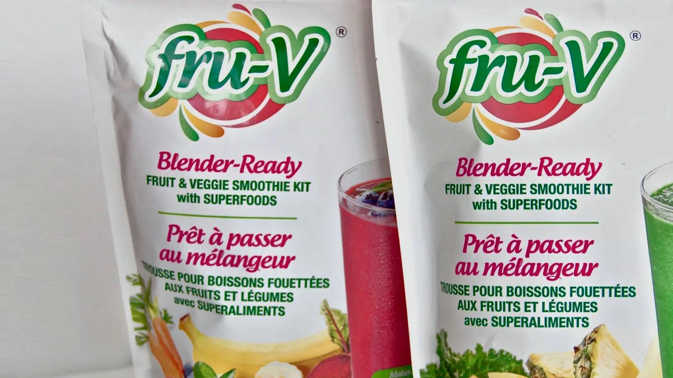
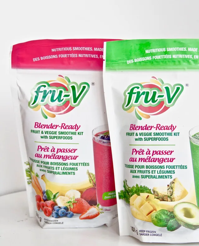
A homemade product meets the shelf of a large grocer with nothing but its pack. Our job was to make the pack, and everything around it, look ready for that shelf while keeping the fresh, family feel the product came from.
(02) The work
What we did
-
01
Logo, colour, type
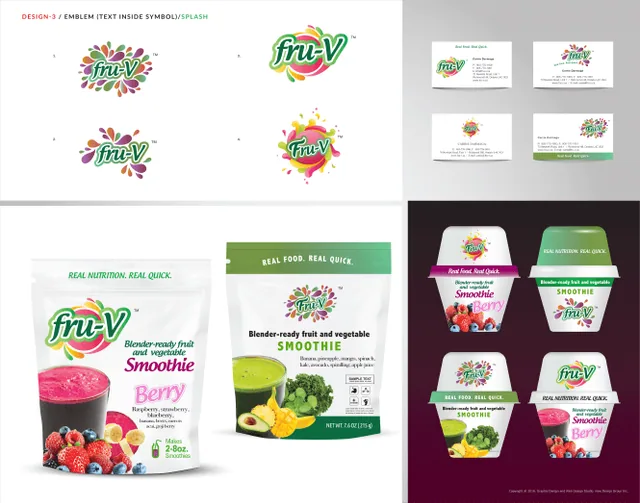
A logo built on the brand's commitment to natural ingredients, a palette chosen for the freshness and variety of the fruit, and friendly, approachable type.
-
02
A look for each smoothie
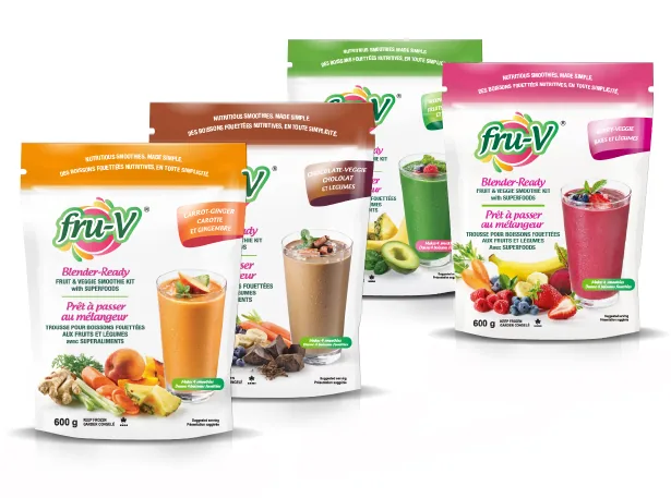
Each smoothie got its own colour code and imagery, so shoppers find theirs quickly and the range stands out on the shelf.
-
03
Posters, flyers, brochures
Marketing materials in the same visual system, so every piece reads as Fru-V.
-
04
Storyboards in their office
We brought the brand and the product line to Fru-V's office on storyboards, to see how they would look in a store before anything went into production.
-
05
Website
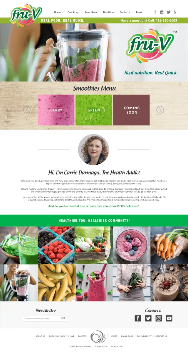
A website that tells the brand story and shows the range, written around the health benefits and the search terms people use.
(03) The result
The result
- On the case page we published at the time: Fru-V went into major retail chains, Longo's among them.
- The founder later sold the business.
Contact
If this sounds like your company, bring it to the call.
Or send a note.