Logo redesign for Napier Outdoors
Napier Outdoors
Vehicle camping tents, founded in 1990
(01) The task
The task
Napier Outdoors started in 1990 as a developer of three tent models and grew into a distributor of vehicle camping tents.
The company wanted a modern brand without losing the identity its customers already knew.
The new logo had to keep enough of the old one for existing customers to recognize it, and still reach new buyers in a crowded market.
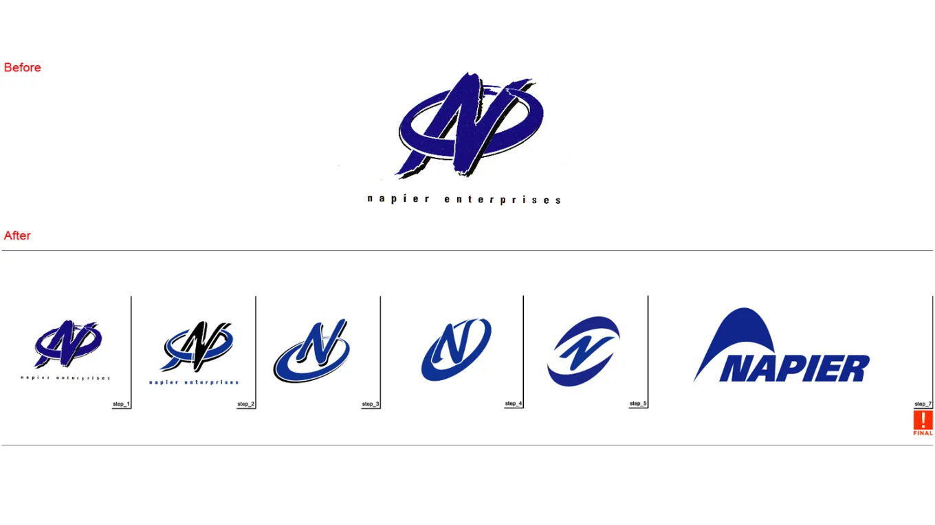
Napier Outdoors had a logo its customers knew: two intertwined initials in a dense blue design. Napier wanted to modernize it, but replacing it outright would have thrown away the recognition it had built.
So the brief was evolution, not a new logo. We kept the initial and the blue, and dropped the complexity around them.
(02) The work
What we did
-
01
Took the old logo apart
The original was a pair of intertwined initials in a complex blue design. We broke it down to see which elements carried the brand.
-
02
Simplified the initials
First concepts simplified the intertwined letters, then we tried different forms for legibility and for use at any size.
-
03
An N shaped like a tent
The chosen direction is a streamlined letter N that reads as an abstract tent: the company's initial and its product in one mark.
-
04
New type and a refreshed blue
A crisp modern typeface and an updated version of the brand's blue, so the logo works from product packaging to digital.
(03) The result
The result
- On the case page we published at the time: customers and stakeholders received the new logo well, and Napier used it in its marketing campaigns.
Contact
If this sounds like your company, bring it to the call.
Or send a note.