
You may think that you have a single favourite colour but in fact, you probably have several: your preferred colour will always depend on a specific situation. Just because a lady loves hot pink on her nails, doesn’t mean she wants to decorate her house in a similar vivid hue. In the home, most people automatically choose a colour scheme to suit each room. People may claim that seaside blues are their favourite colours and so decorate their bathrooms accordingly, but when it comes to the living area; their favourite colour is now a calming neutral beige. Regarding outfits, people also choose what to wear according to some unwritten rules: dark colours such as navy seem appropriate for formal meetings and wintertime, whereas pastels and whites are hot favourites for summer.
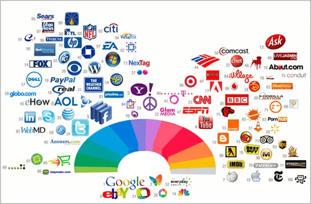
Even if people don’t think too hard about the colours they prefer, they are subconsciously programmed to associate certain colours with specific situations and emotions: and this is true for adults all over the globe.
Harnessing Colours in Advertising
Branding and advertising agencies think long and hard about colour before they choose what to use in a brand development programme or advertising campaign. By carefully selecting the appropriate colour, an advert can send out a powerful message to the viewer even before they have had time to read and understand what the advert is promoting.
Advertising agencies make it their business to understand the psychology of colour to enable them to use it persuasively in their designs. For example, everyone knows that red signals danger and that person automatically react to a red warning sign to avoid the hazard. Why is that? Evolutionary theories believe that early man learnt to associate red with danger: blood, uncooked meat, or the red face of an aggressive adversary. But does that mean that red is never to be used in an advert? Far from it, however, as with all colours, an advert must be created with careful use of colour to ensure it sends out a positive subconscious message – one that is appropriate to what the company is selling and also to the target market.
Mistakes with choosing a brand colour

Imagine visiting a new bank to which you’re thinking of entrusting your savings to and finding the building decorated in soft pastel yellows and pinks. Does your gut instinct say go ahead with your savings plan or do you feel a little uneasy by the wishy-washy decor? And if a nursery school sends you a prospectus in sombre greys and blacks, do you really think that this would be a fun and stimulating place for little Billy to spend his toddler years?
Getting it right
There is no point in fighting against the subconscious messages that colours send out. Advertising agencies must harness the right colour for each campaign which must be perfectly in tune with the products being sold, and with the customers, it wants to attract. Here’s the rundown on the messages that different colours send out and how best to use them in marketing campaigns.

Red
While red signifies danger it can be used to good effect in marketing campaigns which need to evoke strong emotions. Red is associated with passion and love but its strong intensity also signifies excitement, determination and courage. Here’s an example of how to use a rich dark red in a brochure design destined to appeal to those passionate about fashion.
Orange
Orange is also a dynamic and energetic colour but doesn’t have the danger overtones conveyed by red. It draws attention to itself for its lively nature and can be used successfully for modern adverts that want to stand out from the rest, or for campaigns with a youthful target market.

Yellow
Yellow is bright, reminiscent of the sun and full of energy. It also signifies playfulness, amusement, curiosity and happiness making it an ideal colour choice for advertising children’s activities.

Darker yellows, bordering on gold, can give a feeling of prosperity and security and can be used to great effect for financial orientated organizations.
Green
Green is firmly linked with nature and the environment in most people’s minds. It is also associated with reliability, safety, stability, honesty and freshness. It is an excellent colour to form the basis of marketing material for companies concerned with the environment or financial matters.

Blue
Blue is a colour which arouses trust in the viewer. It may be a little serious, but it also suggests success, depth, loyalty, calmness and power. This is why it is one of the most popular colours incorporate brands and designs. Banks, financial institutions and medical companies can always rely on blue in their advertising campaigns to send out the message that the consumer can trust them implicitly.


Purple
While purple isn’t really so different to dark blue, it sends out a whole new subconscious message to the viewer: it’s got the snazzy and daring edge on navy. Purple is associated with luxury, royalty, dreams, mystery and elegance. Light shades of purple are soothing and work well for beauty orientated advertising.

Pink
Pink is sweet, young and vulnerable. It will always be associated with femininity at a subconscious level making it a hard colour to use in advertising if the target market is anything but female. However, a stronger and darker pink has the potential to hold its own against other traditionally non-corporate colours such as yellow, orange and purple.
Brown
Brown is rarely seen as an exciting colour. However, it is associated with nature and is seen as relaxing and casual. Colours ranging from mid beiges to chocolate browns lend themselves nicely to advertising for niche markets where brown is a dominant colour such as coffee and chocolate manufacturers, and pet services.
Black, grey and white
There is nothing more staid than the non-colours: black and white, and all of those greys in between. They depict traditionalism, conservatism and neutrality, and can be used very effectively in advertising. Organisations which want to portray themselves as completely trustworthy and serious, such as legal firms, may opt for black and white designs in their marketing materials. Some daring marketing campaigns may use a monochrome design purely to stand out from the colourful adverts of its competitors.
Colours are wonderful things: they can lighten up our lives and can infuse us with happiness; they can also excite us, calm us down or make us feel reassured and nurtured. Correctly harnessing the psychology of colour in advertising is a very powerful tool: when an advert has the right colour to match the services or products on offer, and one which simultaneously appeals to the correct target market, the advert will form the basis of a successful marketing campaign.
Are you thinking of designing a new logo?
Learn more about how you can build an attractive logo for your business on our logo design page
Using Red in Advertising
The power of red in advertising
Red is one of the most popular colours used in advertising. It is often considered to be such a powerful color because it can evoke strong emotions. Some of the most common uses of red in advertising are to create feelings of excitement, passion, and urgency. Additionally, red has also often been used to convey a sense of luxury or exclusivity. While the use of red can be powerful, it is important to use it correctly in order to achieve the desired effect. However, it is very crucial to note that if it is used too frequently or in the wrong context, it can actually have a negative impact on the viewer.
Red has been used in advertising since the early days of print.
Red has been used in advertising since the early days of print. One of the earliest examples is a 1786 advertisement for Redbreast whiskey, which featured a red-coated soldier. In 1872, British soap company Pears used the color to promote its “white as snow” soap. The campaign was a success, and Pears has used red in its advertising ever since.
Other early examples of red in advertising include ads from Coca-Cola that featured various catchphrases over the years including “Delicious and Refreshing” in red lettering and a 1916 ad for Wheaties that showed athletes competing against each other in front of a red background. It is no secret that Coca-Cola has vastly benefited from its red advertisements over the last 100+ years of marketing.
Today, red is still one of the most popular colors for advertising. It’s associated with excitement, energy, and passion, making it perfect for products or services that want to convey these qualities to consumers.
Associations: The colour has a variety of associations that can be used to create powerful ads.
When it comes to the colour red, there are a variety of associations that can be used to create powerful ads. For example, red is often associated with love and passion, making it a popular choice in advertising for products such as dating websites or romantic vacations.
Additionally, red is thought to be an energetic colour that can increase heart rate and make people feel more alert. This makes it a good choice for advertising products such as energy drinks or sports equipment. It’s also used in restaurants, cafes, and other food-related businesses.
Impact: Red can create an emotional response that leads to action.
Red is one of the most eye-catching colours in the spectrum. It can create an emotional response, leading to action. For example, when politicians use red ties and clothing, they are trying to evoke a sense of power and passion. In fact, studies have shown that people are more likely to donate money to charity if they are given a red envelope as opposed to any other color. This is because the color connects with us as a symbol of the heart & its association with passion & power.
Red can be used in a variety of ways to create memorable ads
People often think about the colour red when they want to create a powerful and memorable advertisement. This is because red can be used in a variety of ways to create an impact. For example, red can be used in print ads to stand out in newspapers or magazines. It can also be used in TV commercials to grab the attention of viewers. Additionally, red can be used on websites to create a sense of urgency or excitement. Ultimately, using red in advertisements across many mediums is a tried and true way to spice up your advertisements.
Red is a powerful color that should be used carefully in advertising.
When used correctly, red can be a very powerful colour in advertising. It is often associated with excitement, energy, and passion. Brands such as Coca-Cola, Mcdonald’s, Netflix, Nintendo, and more have long used red in their branding and marketing efforts. The color is extremely effective in creating an emotional connection with consumers, and invoking action.
However, it is important to use red sparingly so that it does not become overwhelming or cliché. In the wrong hands, red can be ineffective and even offensive to your target audience.
Want to learn more about other popular colors in advertising?
Click Here To Read Our Article On Psychology & Advertising
A Short History of Psychology for Advertising
Leveraging Psychology in Advertising
Psychology has long been leveraged in advertising, dating back to the early days of commercial television. Advertisers have always been keen to understand what motivates consumers and how they can be persuaded to purchase a product or service. By understanding human behavior, advertisers are able to more effectively sell their products. In recent years, psychological research has become increasingly sophisticated, providing advertisers with even more powerful tools to influence consumer behavior.
Learning How Customers Process Information
There are two very influential models when it comes to understanding how consumers process information.
The first model is the Consumer Processing Model which explains how people process information about products and services. This model is often used by advertising agencies to understand how consumers process information about a product or service. The model consists of three stages: attention, comprehension, and yield.
The second model is the Hedonic Experiential Model which states advertising affects our emotions and perceptions, which in turn influence our purchase decisions. This model suggests that ads must be carefully crafted to appeal to our senses and tap into our emotions in order to be effective.
This model has been used extensively by advertisers to create effective campaigns. By understanding how we process information and make decisions, they can better target their messages and influence our behavior. In many ways, the Hedonic Experiential Model is a tool for understanding how we interact with the world around us.
Brief History of Psychology & Advertising
Have you ever been persuaded to purchase something, even when you weren’t even planning to buy? If your answer is yes, then you have probably experienced psychological advertising at its very best. And the art of using psychology in advertising is no new thing. Two famous American psychologists are credited as being some of the first to explain how advertising is far more effective when the consumers’ psychology is taken into account.
John B Watson (1878-1958) was an American psychologist who conducted psychological research into advertising amongst other things. He had a controversial career, in part due to his academic work on conditioning children, and also for a scandalous divorce. After being fired from his academic post at Johns Hopkins, he moved to the US advertising agency J. Walter Thompson. It was a time of huge growth in the availability of products and services, and advertisers were keen to use psychology to improve their marketing success.
Watson started off in door-to-door sales as he wanted to become an “honest-to-goodness working advertising man”. Watson concluded that marketing depended not on appealing to rational thought, but appealing to emotions and stimulating desire for the product. In fact Watson told advertisers to stir up the consumer’s emotions: “tell him something that will tie him up with fear, something that will stir up a mild rage, that will call out an affectionate or love response, or strike at a deep psychological or habit need.”
While this might be a psychologically sound way to guarantee an advertising campaign gets noticed, not many advertising agencies nowadays would recommend instilling fear or anger in consumers in an attempt to get them to purchase!
However Watson headed a number of successful advertising campaigns. His high profile Ponds cold cream adverts commonly had 3 specific elements:
- they evoked an emotional response
- they gave instructions on how to use the product
- the adverts had direct testimonials
Testimonials were nothing new in advertising but had fallen out of favour because they had been used extensively by manufactures of ineffective and sometimes dangerous medicines. But Watson’s testimonials for this beauty product were highly effective in persuading consumers to buy. And indeed this trend has continued until today – glossy magazines are littered with beauty product adverts and accompanying celebrity endorsements.
Another effective campaign targeted at women and evoking an emotional response was that for Pebeco toothpaste. Watson used a seductive looking woman and encouraged women to smoke – so long as they used Pebeco toothpaste. This advert had nothing to do with the health benefits of the toothpaste but was all about making the consumer more attractive to the opposite sex.
Watson clearly saw advertising as an opportunity to sway people to buy specific products, whether they had thought about buying them beforehand or not. His vision has led to him being credited with a number of very successful advertising campaigns in the early 1900s.
Walter Dill Scott (1869-1955) was another influential American psychologist in the world of advertising. An advertising executive approached him in the early 1900’s who wanted to make his marketing more effective. In 1903, Scott published his first book in this area: “The Psychology of Advertising in Theory and Practice”. His theory was that evoking emotions, sympathy and sentimentality via adverts could easily influence consumers. Instead of seeing adverts as a source of information, he believed they were primarily for persuasion.
His recommendations to advertising agencies were:
- Give direct commands to use the advertised product, such as “Use Hoover vacuum cleaners”
- Use return coupons – as this requires the consumer to take action
- Use illustrations in adverts which must attract plenty of attention
- Place adverts in publications which instil confidence in the consumer
By 1910, Scott’s techniques were commonly used in America and in 1913 he proposed an advertising model, which outlined the various stages that a consumer must be taken through before they will buy a product:
- Gain the viewer’s attention
- Focus the consumer on the message so that they have positive feelings about the product or service
- Make the consumer understand and remember the message
- Cause the consumer to desire the product and to take the desired action
Of course, for those of you with a marketing background, you will clearly see that this forms the basis of the contemporary model of marketing, AIDA (Attention, interest, desire and action).
Watson and Scott may have been born more than 100 years ago, but they understood that successful advertising is all about the art of persuasion; how to make a consumer believe that they need a particular product and that their lives will be much better if they purchase it. Nowadays their advice and models still hold true, and advertising agencies all over the world use these psychological insights in every advertising campaign they create.