
Last updated on

Google has announced that on 21st April 2015 the algorithm will be expanding its use of mobile-friendliness as a ranking signal for mobile searches. Previous Google updates have taken into account whether a website is configured correctly and viewable on mobile devices, and have made it easier for users to find mobile friendly websites, but to a lesser extent.
The new announcement means that those searching Google via a mobile device will be shown mobile-friendly web pages in preference to others. Google warns that “this change will affect mobile searches in all languages worldwide and will have a significant impact in our search results.”
Before you roll your eyes to heaven and complain that it sometimes feels impossible to keep up with Google updates, let’s be realistic: Google updates are always made with the end user in mind. And as more people are using mobile devices to access the net, this update was inevitable.
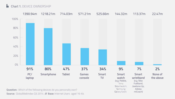
Global Web Index (GWI) found in Q3 2014 that across 90% of the global internet audience surveyed, 80% of adults owned a smartphone (with 75% using it to access the internet) and almost 50% owned a tablet (with 37% using it to surf the net).
All business owners should already realise that they need a mobile-friendly website to provide mobile users with a good online experience. With Google’s latest announcement there is an even bigger incentive to get their website sorted.
It’s no secret that Google has been trying to factor user experience into their ranking evaluations as much as possible in the past few years. It’s no longer enough to simply display the information relevant for your users; it should also be effortless to consume it.
With the explosion of mobile device usage, Google has adapted their crawlers and algorithms to also check how a website caters to this type of users. As such, ranking results may differ significantly for a query made from a PC than the same one made from a smartphone.
When it comes to users browsing from their smartphone or tablets, speed and accessibility are decisive, and the users’ patience is far more limited when compared to their desktop and laptop counterparts. While it may take 2 seconds to find and click that product category button on your PC, it may take a lot of zooming and scrolling to achieve the same result on your phone. And that’s if you don’t accidentally tap the button right next to it, which can lead to a very frustrating experience.
To help webmasters better identify whether their sites provide a good mobile experience, in May 2014 Google added “User Experience” recommendations in their PageSpeed Insights tool, a small web application that allows owners to check their site’s performance.
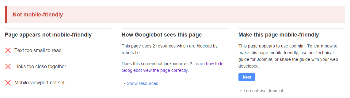
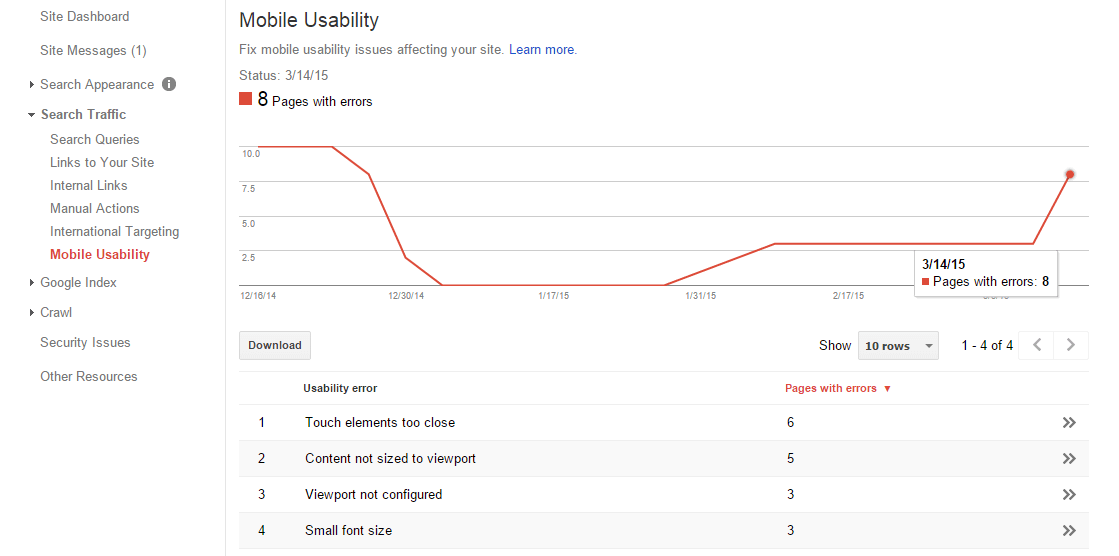
Fast-forward to the end of October, when Google announced their Webmaster Tools addition for site owners to track pages that feature “Mobile Usability” errors. By mobile usability they actually refer to five guidelines:
A few weeks later, Google launched the “Mobile-Friendly Test” tool, a public web app similar to PageSpeed Insights, which checks any given page (whether it belongs to a website that you own or not) against the guidelines mentioned earlier.
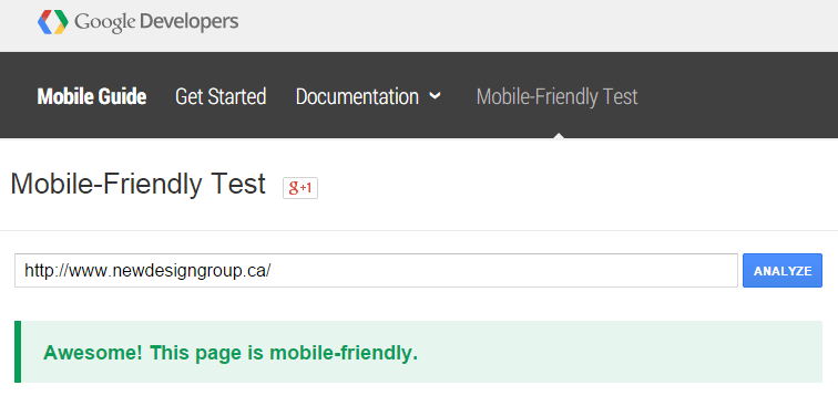
At around the same time, the search engine also officially launched the “Mobile-Friendly” label in search results, making it easier for users to identify which results offer a good user experience for mobile devices.
The “Mobile-Friendly” label is applied based on the result of the test tool. If you pass the test, you get the label. If you don’t, even if you fixed 99% of the issues, the label won’t be displayed next to your URL.

Starting on the 21st of April, the update that boosts pages offering a good mobile experience will be applied solely based on this “Mobile-Friendly” label. If you have it – you get the full benefit of the effect. If you don’t – well, you get the idea.
The majority of websites that will suffer from this update will be the ones that only feature a desktop-oriented design. Adapting the design to work for smartphones and tablets as well may be easy, requiring a few changes to stylesheets, or may be difficult, requiring a complete redesign.
There are different ways to create a mobile website and it’s important to understand the types available from both a design and SEO viewpoint. In their Mobile SEO guide, Google lists three possible mobile configurations that site owners can choose from: Responsive Web Design, Dynamic Serving and Separate URLs.
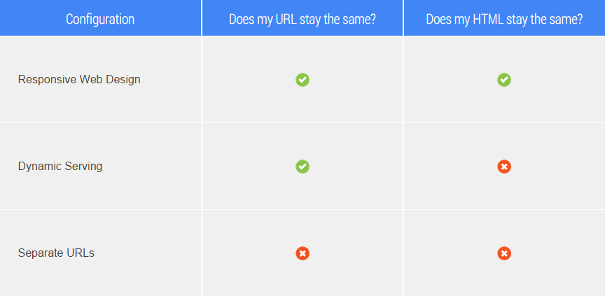
A responsive web design is where the desktop web design is adapted to the user’s device – the same HTML code is sent to all devices but the browser is instructed on how to adjust the width of the page to best fit the device screen (known as rendering) using CSS. Thus the website “responds” to the device it is being viewed on.

Responsive Web Design – Google’s Mobile Guide
Advantages
Disadvantages
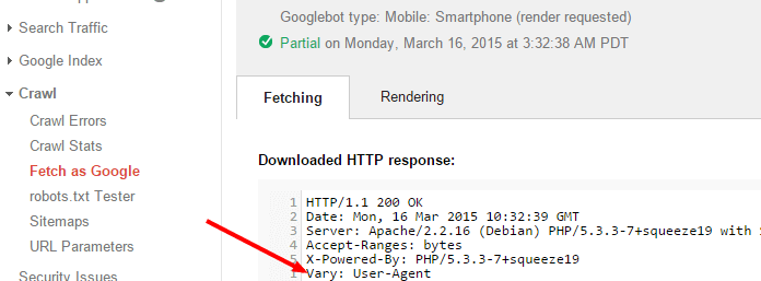
Dynamic serving implies that a separate version of the design is created for mobile users, but the URL of the desktop website is maintained. Using this option, the HTML code and associated CSS is served to different devices depending on the requesting ‘user agent’ – for example a desktop user agent or a mobile user agent.
To ensure Google properly understands this, a “Vary: User-Agent” header is added to the page.

Dynamic Serving – Google’s Mobile Guide
Advantages
Disadvantages
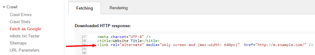
In this configuration, the desktop URL has an equivalent but separate subdomain created specifically for users of mobile devices (such as m.domain.com). A separate page is then served to desktops and mobile devices, using user-agent detection and proper redirection to the correct URL.
To serve the right URL for users in Google search results and consolidate ranking signals, a “rel=alternate” tag needs to be configured for the desktop version and a “rel=canonical” tag needs to be configured for the mobile version.

Separate URLs – Google’s Mobile Guide
Advantages
Disadvantages
Once your mobile website is up and running, you’ll want to make sure that you check everything is in order:
1. Run the Mobile-Friendly Test tool on a few page types (homepage, category page, product page, article page) to make sure your design team didn’t miss anything, and that these pages pass the test.
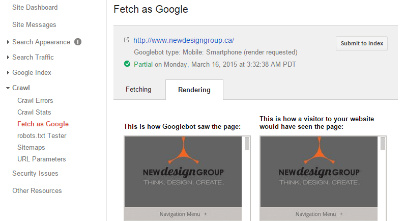
2. To make sure Google “sees” these pages properly, use Webmaster Tools’ “Fetch as Google” feature (with Fetch and Render), using the Mobile: Smartphone option, to verify that there are no obvious missing elements in the design (like images or sections of the page) when compared to what the user sees.
3. If you opted for Dynamic Serving, use Webmaster Tools’ “Fetch as Google” feature (or through a third-party tool such as http://web-sniffer.net/) to ensure the Vary HTTP Header is properly set.
4. If you opted for Separate URLs, use Webmaster Tools’ “Fetch as Google” feature, using both Desktop and Mobile: Smartphone options (or through manual inspection or a third-party crawling tool, such as Screaming Frog) to ensure canonical and alternate tags are properly set.
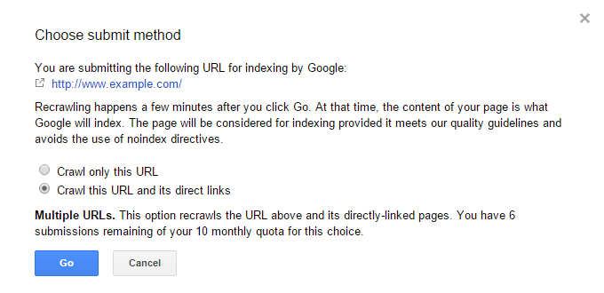
5. After everything checks out fine, use the “Submit to index” feature on the homepage and main categories (using the “Crawl this URL and its direct links” option – you get 10 of these a month) to expedite the indexing of your design and code changes.
6. Monitor the “Mobile Usability” section in Webmaster Tools for any errors that may show up over time. Unfortunately, this section is only updated every few days, so you’ll need to be patient to view the first results.
You should now be “mobile-proof”: ready to offer your users the best possible user experience and also benefit from Google’s ranking boost. Good luck!
PS: Looking for help to get your site mobile and SEO ready? Give us a call!