In Canada the use of mobile devices such as smartphones, iPads, and other tablet computers has seen a huge increase over the past year. It has been estimated that as of 2021 the percentage of mobile devices is approximately 50% of the sessions on the internet. As people are getting more comfortable with their devices, they are no longer limiting their use to checking the weather, reading the news, logging into Facebook, and making the odd voice call; Statista shows that more and more owners are turning to their trusty mobile to browse the internet and to shop online.
Advantage To Making Your Site Responsive

This is music to your ears if you’re a business owner with a great website. If people can surf the net on-the-go and aren’t restricted to specific times in front of their desktop, they’ll have plenty of opportunities to find your website. Good news for you, the business owner. It’s also great news for the customer, who can consult the internet to find out what they want when they want it.
Mobile Centric User Experience
However, give a thought to the kind of web experience you’re offering the mobile user. Will they have to zoom in and out to view the web pages if they access your website from their device? Will the web pages look as good on their smartphone as on a laptop? Will the customer be able to easily find out what they want to know?
If your website was designed for a desktop and doesn’t have a responsive design, the mobile user will find your website confusing to read and navigate – it just won’t adapt to a smaller screen. And of course no one will battle to read what you have to say and offer. The mobile visitor will give up on your website if it can’t be used intuitively on a smartphone, regardless of how stunning it might be on a laptop.
The only solution if you want to retain customers and generate sales is to have a responsive web design which can be easily viewed across multiple platforms. This way the user will have an optimised online experience from whatever device they use to access your site. And customers who have an excellent online experience will stay awhile, browse around and be more likely to contact you or buy online.
What True Responsive Website Design Means

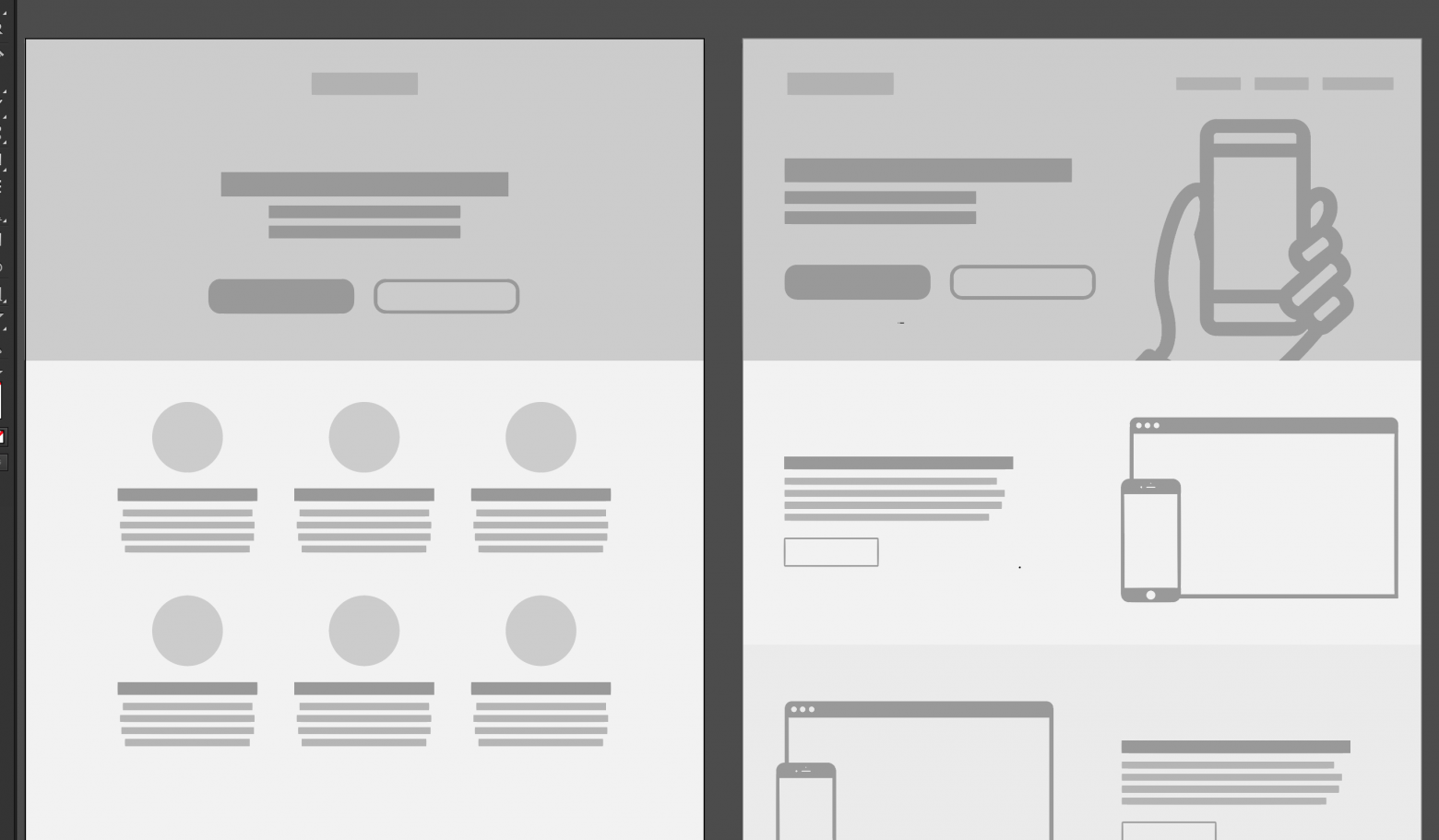
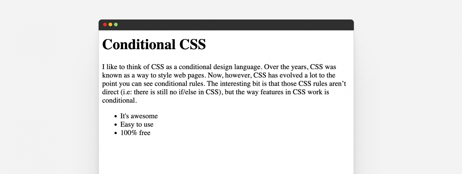
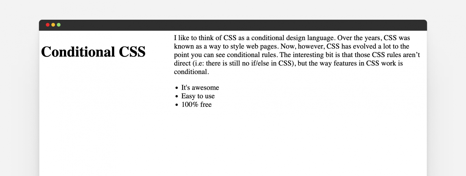
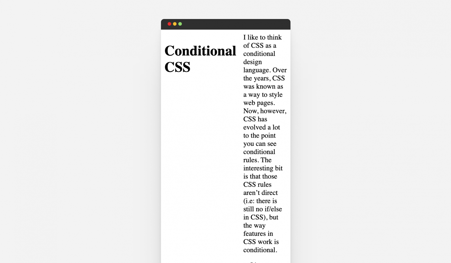
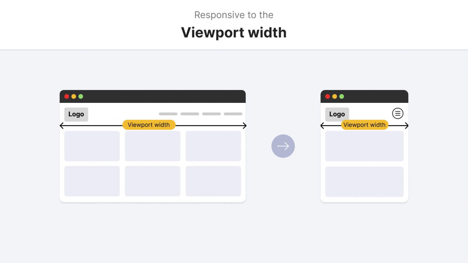
A responsive web design offers the viewer easy navigation and simple reading without the need for excessive zooming and scrolling whether the pages are viewed on a smartphone, tablet, laptop or desktop. In short the website is intelligent enough to resize itself and actually alter the page’s layout to suit the device it is being used on. This is achieved by smart website developers who can make a website in 4 columns on a large PC self-simplify down to 1 column on a smaller device. Developers can also ensure the website detects the type of device it’s being viewed on – and then in the case of a touch device, can enable an option to allow the user to simply swipe between columns.
Don’t Get Left Behind
Companies that have implemented responsive websites are rightly delighted with the results. However, this proactive approach is not being embraced by all: many e-commerce companies and service providers have failed to jump on the responsive design bandwagon. Perhaps they are quietly confident that they will still generate sufficient sales from customers who browse only on laptops and desktops.
But as current statistics keep reinforcing the amazing rise in the use of mobile devices to surf the net, would you, as a business owner, be prepared to take the chance? If a company doesn’t wise up to the fact that they are alienating users who do internet searches on a mobile device, they are sadly saying bye-bye to potential revenue.
It’s all so very simple. More and more people are searching the internet on their mobile devices to locate what they need. So it follows that only those companies who have websites with great functionality across a variety of platforms will appeal to the masses. Don’t be a company that ignores the needs of mobile web users: your potential profits will suffer. Instead, stay ahead of the game and get a responsive web design. If you are interested in finding out how to make your website responsive feel free to reach out to us for a free estimate on your website today!


