
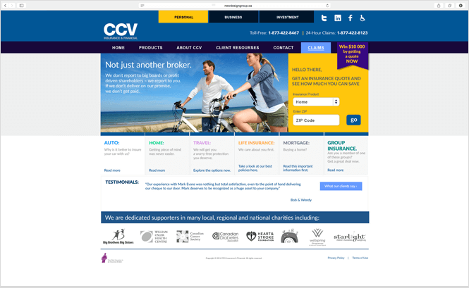
Unsurprisingly a well constructed insurance company website which allows users to find accurate policy information, to quickly obtain a quote and to manage their policies with ease, will win more online business than a website which fails in some or all of these respects.
So it’s interesting that a 2013 study by J.D. Power found many big insurance names weren’t living up to clients’ expectations when it came to website performance. J.D. Power’s Insurance Website Evaluation Study reviewed clients’ online experience with regard to the ease of:
- finding policy information
- getting information about applicable discounts
- getting a personalised quote
- managing their policy online
Unfortunately customers reported a degree of difficulty in completing all of these tasks. And particularly interesting (at least it should be to all insurance companies!) was the fact that clients were more likely to buy a more expensive policy from an easy-to-use website, than buy a cheaper version from a confusing website that left them feeling frustrated.
Insurance companies who want to sell more policies online and keep existing clients happy need to think carefully about their web design: a redesign and addition of new functionalities may well be in order if they don’t want to lose out on business.
Here are our 3 top tips for insurance company web design that will sell more policies and help the company remain competitive online.
- Website Navigation
Potential clients don’t want to have to navigate through a myriad of pages to find what they need. Insurance policy information must be simply accessible from the home page and the information must be laid out so it’s an easy read in language that is clear and limited in its use of legal jargon. Any discounts applicable to each policy should also be found with a single click of the mouse.

- Website Quote
If a company wants to sell its policies, it must provide clients with a no fuss quote – and quickly. People won’t hand around waiting for pages to load – they’ll simply bail out and head to a website which has a sleek and rapidly functioning quote calculator.
Of course it may be that the CEOs are quaking in their boots at the thought of their website churning out inaccurate automated quotes – but what clients want, clients must get if they are to part with their money!
A good, user-friendly website quote function must:
- request only the bare minimum of data which must be easy to input. Pages and pages of unnecessary questions are a no-no since they will simply irritate the user. A great way to achieve this is by developing a prefilled form functionality on the website – the user inputs a key piece of information, such as a driver’s licence number, and the related information is automatically imported into the form.
- provide the calculated quote swiftly.
- present the quote clearly to the client identifying if any discounts have been applied.
- Customer Ease Of Use
In the aforementioned study, users were asked how easy it was to manage their existing policies online. Whilst paying bills proved simple, it became more tricky to modify an insurance policy or request a replacement ID card.
Cynics could conclude that insurance companies are more focused on getting the money in, rather than making their clients’ lives easier.
Companies who want to gain a bigger share of the target market will give both aspects equal weighting when developing their web design – they will ensure that not only are online payments easy to complete, but that clients who wish to modify their policies can do so with minimum fuss.
And to make things even easier for clients, the current and recommended trend is to include videos on the website which provide the user with all manner of pertinent and useful information to advise them and help them purchase the right policy for their needs.
In conclusion, insurance company websites need to be 100% client focused and to make it as easy as possible for users to shop, purchase and manage their policies. Companies who move with the times, redesign their websites to embrace easy navigation, to provide a quick and accurate quote function and to make the whole online user experience a pleasure rather than a pain, are those who will attract and maintain new business time and time again.