

Red Bay Lodge Resort
Red Bay Lodge.
Tourism & Destinations
Verbal Branding
Brand Identity Design
Brochure Design
Website Design
Back in the day, Red Bay Lodge in the heart of the Bruce Peninsula, was known as a great location for people interested in activities such as fishing, hiking and cross country skiing. However the resort became jaded in recent years, until it was sold to a new owner.
In addition to a com1plete refurbishment of the resort, the new owner realised that the company needed to be rebranded. He approached New Design Group to create a new and modern brand identity which would communicate to potential guests that the resort was under new management. It also needed to transmit the resort’s brand promise – that of unmatched hospitality services and a range of accommodation ideally positioned for people wanting to enjoy activity breaks.
New Design Group worked closely with the owner, who had great ideas on how best to refresh the visual brand identity.
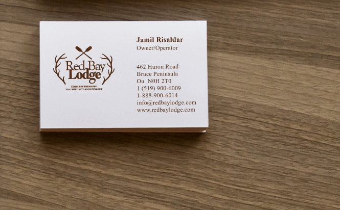
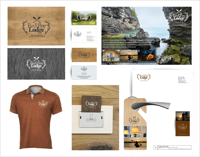
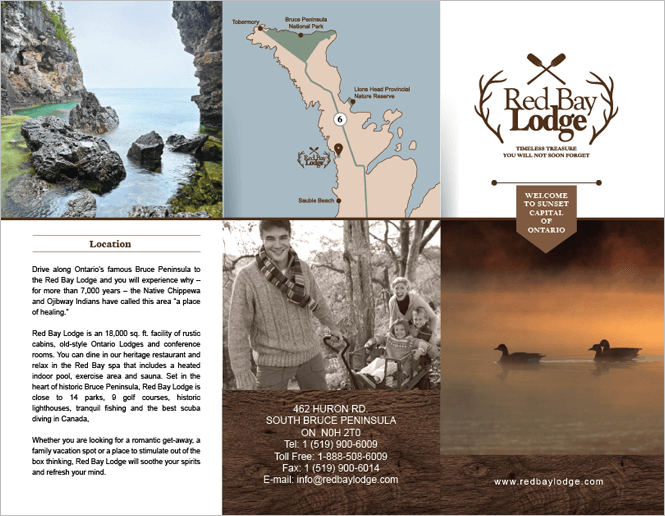
at the heart of any brand, the logo must quickly convey what the company offers. The original Red Bay Lodge logo shows the company name and an image of a duck swimming. It appears very outdated and doesn’t reflect what the resort offers. New Design Group created a new resort logo design where the resort name is positioned between two branches and crowned with two boat paddles, suggesting the proximity of the resort to the great outdoors. The use of a dark wood background further reinforces the sense of being close to nature and that the lodge offers wood cabins for holidaymakers.
the logo in a rich, dark brown, on a simple white background is the basis of the company business card.
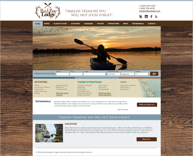
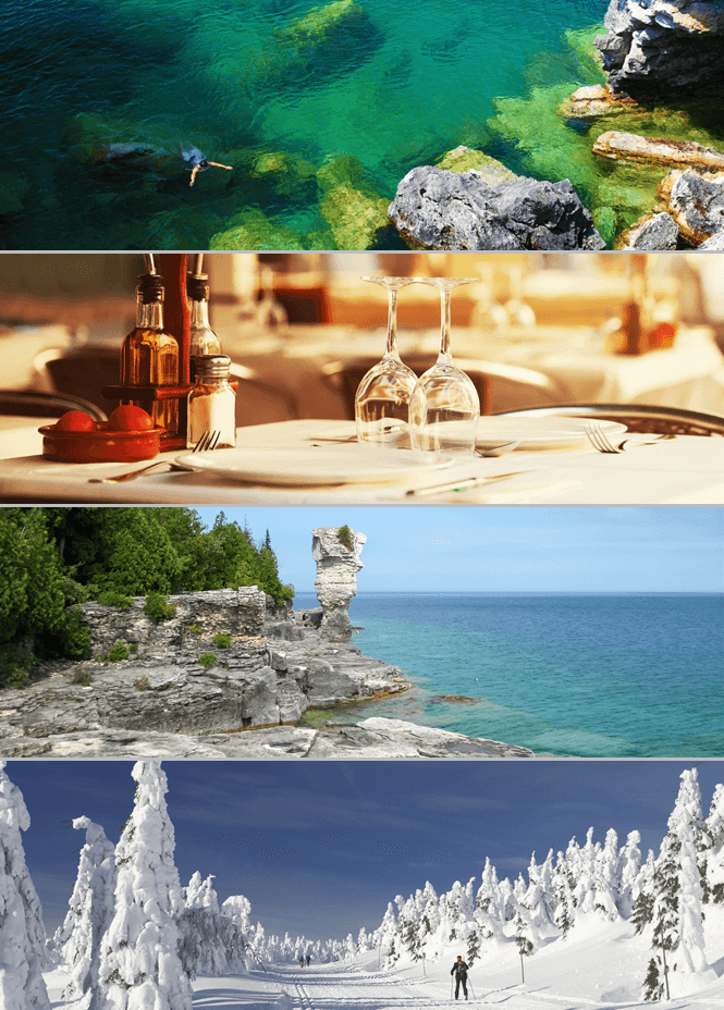
as with any holiday resort, the website is fundamental to showcase the facilities to potential clients and to enable them to book online. The overall look of the resort web design is professional: it shows stunning images of scenery and activities, using earthy tones in keeping with the brand colour palette, the layout is simple and effective, and it is easy for the web visitor to navigate to find what they need.
The online Reserve Your Vacation is clearly displayed on the homepage, enabling clients to check availability and prices of their chosen holiday. The standard rates are also clearly displayed on a separate page for ease of reference.
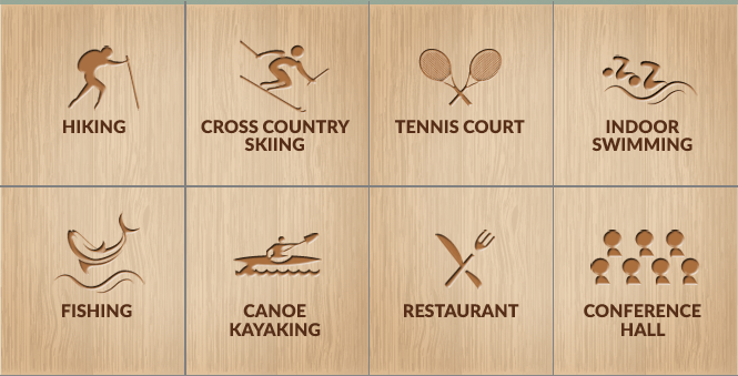
As the local activities are important to the would-be visitor, a separate page was created to provide information on these. Modern icons were created for all activities from kayaking to skiing, and to maintain brand consistency, the figures are displayed on a light wood background.
Other information is also provided for customers including information on the resort amenities and local attractions. And as with Ontarian regulations, the website is AODA compliant.
New Design Group also designed other items required by the resort, maintaining brand consistency throughout: branded staff uniforms, branded key cards, company stationery and branded door handle hangers.
All in all, the Red Bay Lodge rebranding project resulted in a new, strong brand identity leaving the owner confident that he would attract new business to the modernised resort.