
Last updated on
In recent years, the retail industry has increased its focus on design and packaging. It is widely accepted that the way products are presented has a significant impact on consumer behaviour. For example, studies have shown that eco-friendly packaging is perceived as having higher value in the product where consumers are willing to pay more. Consequently, retailers are increasingly using eco-friendly packaging in order to motivate consumers to purchase their products.
In our fast-paced, image-driven world, it’s no surprise that design and packaging play a big role in motivating people to buy your product. Consumers often make split-second decisions based on what we see, and if a product’s packaging is eye-catching and inviting, they are more likely to give it a try.
The colours, fonts and sizes help a product look more credible, high quality, and expensive or speak to different audiences in different ways. The design also conveys important information about a product, such as its size, price, or ingredients.
When it comes to food products, package design is especially effective in making people crave certain items. Jenn David has provided a quality breakdown of colours with food packaging and explains how red and yellow are the best colours for evoking taste buds and kicking our appetites into gear. For food packaging, colours should denote a product’s flavour whenever possible. Blueberries in an image that has been adjusted to be orange do not work in the brain. Consumers’ brains need to immediately understand what they are looking at to make them stop and investigate further. With 2-3 seconds glancing at products down the aisles, a food package must trigger as many senses as possible, even subconsciously, to have an advantage over other brands.
Take a look at the items you bought on your last shopping trip. How many of those packages are distasteful to you? Probably very few or they wouldn’t have made it out of the store!
Product package design is a critical element in the success of your product. It can make the difference between a product flying off the shelves or gathering dust in the store shelves.
Giving package design time and money to ensure it is done right will make the difference.
Studies show that people are more likely to purchase products that are packaged in blue or green colours. This is because these colours are associated with trustworthiness and relaxation. On the other hand, people tend to avoid products that are packaged in red or yellow colours as these are associated with danger and excitement. That being said, bright colours may be better overall than muted ones.
Bright colours tend to stand out and attract attention, while muted colours blend in and may be overlooked. For example, a brightly coloured package may catch the eye in a store and make consumers more likely to read on to learn about the product inside. A muted colour palette may convey sophistication and quality. If a product has a lot to say or requires some education in order to fully understand its value, having a show-stopping attention-grabbing package may be the best bet to encourage people to read on and be educated about the product.
The shape is another important factor in product packaging. In the market, we see that larger product packages are often perceived as being more valuable or luxurious than smaller ones. They take up more space, which makes them appear more substantial. In contrast, smaller product packages may be seen as being more affordable or convenient. They are also easier to carry home and store. Naturally, size can be subjective. A large diamond will always appear more substantial and valuable than a small one, but it will still be much smaller than a lamp or a pumpkin, both of which hold much less value. Exaggerating packaging in a way that feels useless will quickly make customers question the producer’s efficiency.
Let’s take a look at some examples of products that have used successful design and packaging:
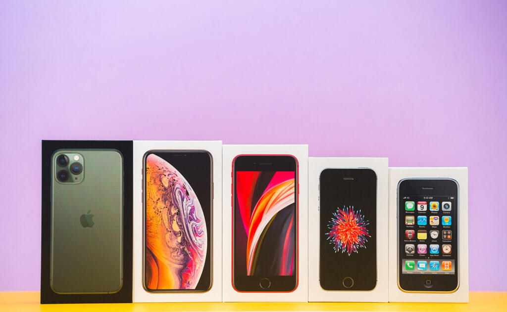
Apple’s iPhone had one of the most successful product launches in history. The sleek design and user-friendly interface made it a must-have for many people.
Apple
Today, Apple is one of the most successful companies in the world. A big part of their success is due to their product packaging. The iPhone’s sturdy white box product package is clean, simple, and effective. It protects the product and catches customers’ eyes.
The package front shows a picture of the iPhone, and the back has basic information about the phone. The package is designed to protect the iPhone from damage during shipping and handling. It also keeps the phone clean and free of fingerprints. Furthermore, the packaging is recyclable and made from recycled materials.
The iPhone product packaging is successful because it has eye-catching, protective, and environmentally friendly elements.
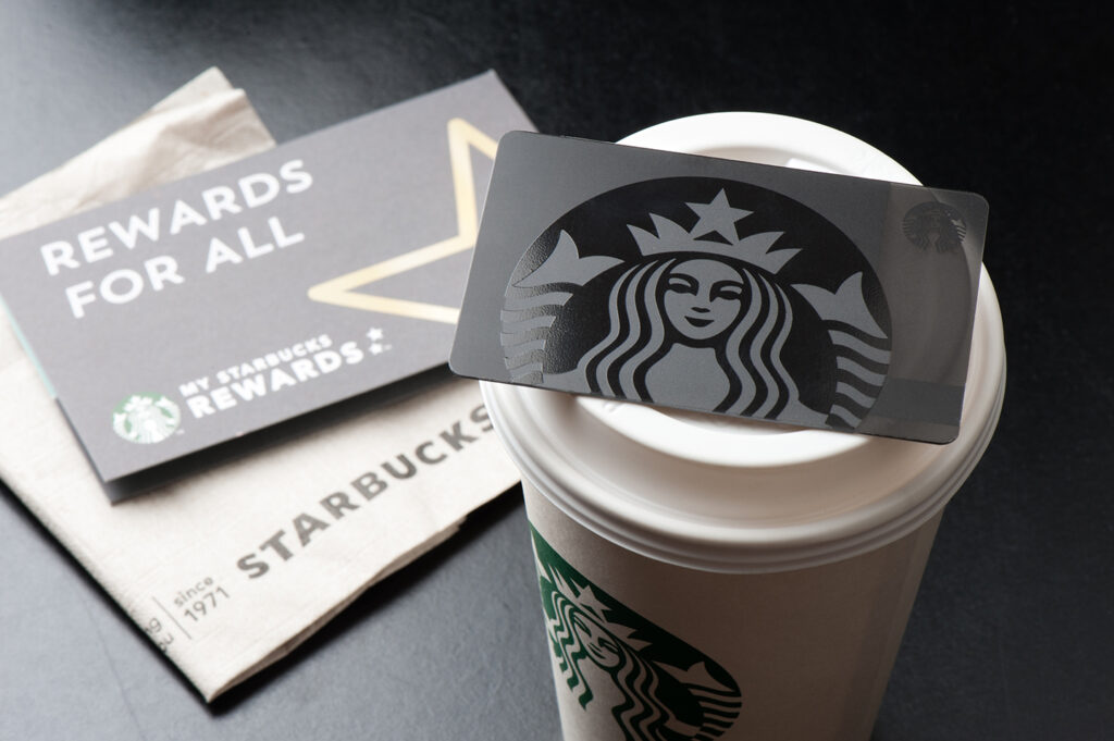
Starbucks
The second example of amazing packaging is Starbucks’ elegant designs. This huge brand has expanded across the entire world with its symbol of fresh, consistent, quality-tasting coffees.
Starbucks Creative director of Packaging, Mike Peck, gave a presentation called “Packaging Retail Experience,” identifying their process of choosing packaging and the desired outcome. He explained the shopping experience of Starbucks is very different from that of a busy supermarket, and the coffee packaging aimed to bring consumers back to that cosy Starbucks feeling of being in an intimate cafe with a friend or a good book. Starbucks packaging, whether in the coffee shop or the supermarket, mixes heritage with modernity and highlights important storytelling elements right on the outside of the packaging. Starbucks is known for its dynamic attention to its packaging, making package design choices that stay up-to-date with trending colours and styles. Starbucks is consistently relevant and on-trend,
Whether they are in North America or Australia they know that Starbucks coffee can get them through the day and taste delicious. And, they know exactly the right symbol to look for and find it.
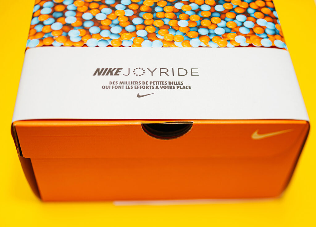
Nike
Another example of successful product packaging is Nike’s Air Jordan shoes. The iconic design of the shoe, along with its stylish packaging, made it one of the most popular brands in the world.
An important factor in Nike’s success is its packaging. The shoes come in a bright, eye-catching box that features a picture of Michael Jordan, the NBA legend who endorsed the shoes. The box also has a spot for collectors to display the shoes when they’re not being worn.
Nike’s packaging for the Air Jordan shoes is so successful because it’s both functional and collectable. The bright colours and Michael Jordan graphics make the shoes stand out on store shelves, and the box has become a collectable itself. Nike struck gold with its Air Jordan shoe packaging, and it’s one of the reasons why the sneakers are so popular.
These are just a few examples of products that use successful design and packaging to stand out in today’s competitive marketplace. It’s more important than ever to make sure your product is well-designed and packaged in order to be successful.
Some people are motivated by price, while others are more concerned with quality and societal status.
The best thing to remember before you start designing your packaging with an agency is to do a thorough analysis of your target market. Having a detailed consumer persona makes all the difference between having a packaging that connects with your audience and having ineffective packaging. Testing and adapting can also greatly increase packaging success as the world moves quickly and in many directions.
One thing is for sure. The process of finding the right packaging takes time and focus to get it right. You must give it time and careful consideration or risk having your high quality, the credible product quickly gets undersold.