

Burnham Dental is the oldest dental practice in Peterborough, Ontario. With a well established clientele and skilled doctors leading a friendly team, Burnham Dental decided it was time for a complete rebranding to coincide with their move to a brand new building.
The Challenge
The existing website for Burnham Dental was an unusual black and white design and although it also contained plenty of client information, the website and associated brand needed a far more modern look.
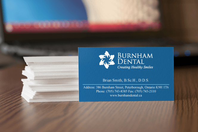
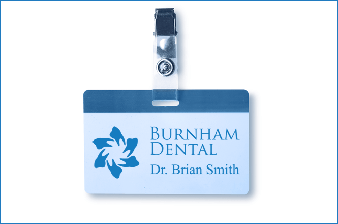
Burnham Dental hired New Design Group to rebrand their business, focusing on the logo, website, business card, uniforms and signage for the new building.
The Solution
New Design Group created a new logo which on first viewing could be mistaken for a flower – but on closer inspection the petals can be seen as simplified outlines of perfect teeth. This clever design is reassuring – flowers in general are symbolic of growth and positivity – and the subtle depiction of perfect teeth suggests that is the objective of this clinic.
The chosen brand colour is blue – a gentle and calming colour which is an excellent choice for a dental practice – a place most people would not choose to visit. Additionally blue suggests reliability and trust.
The brand colour and logo were used on the website, uniforms, business cards and signage within the new building to build a cohesive and consistent brand identity, and to allow this well established dental practice to show itself in the best possible light and attract new clients to its dentist’s chair.