
Last updated on
Google has completely overhauled its SEO Starter Guide, presenting five methods for designing a targeted webpage that instills trust and enhances the overall user experience.
Promoting user-friendliness in web content is a practical strategy. The recent Google antitrust trial has brought to light the significant influence of user interactions in Google’s algorithm, known as Navboost. A patent that might pertain to Navboost discusses how user interactions contribute to establishing a document-level score, which can ultimately boost a website’s ranking. This implies that crafting a document that fosters positive user interaction signals can potentially enhance a site’s ranking (learn more about the Navboost patent).
The previous version of the document featured sentence-level internal links to other webpages; however, they were not always semantically relevant within the given context, and the anchor text used did not sufficiently describe the linked webpage.
Here’s an example of an improved link to an explainer webpage about site maps:
In the old version, the link directed to the explainer with the entire sentence:
“Learn more about how to build and submit a sitemap.”
In the new version, the link to the same page is as follows (linked words in bold):
“If you’re open to a little technical challenge, you could also submit a sitemap—which is a file that contains all the URLs on your site that you care about.”
Utilizing topic-rich internal links is a valuable approach for creating links to other webpages that are beneficial to readers, as the link’s context aligns with the topic, making it more meaningful compared to linking to a webpage devoid of relevant context.
The most noticeable alteration is the significant reduction in length of the new starter guide compared to the old version. The original webpage contained approximately 8,639 words, whereas the updated document comprises about 4,058 words. Consequently, the new SEO starter guide is 53% smaller in size than its predecessor.
Furthermore, the original guide featured a total of 92 heading elements, ranging from H1 to H5. In contrast, the updated document includes only 27 heading elements, spanning from H1 to H3.
What’s intriguing is that while the starter guide’s overall size decreased by 53%, the usage of heading elements decreased by a substantial 71%. This suggests that if the rate of heading usage had remained consistent, the updated document would have retained a relatively similar proportion of headings (53%). However, this was not the case.
In actual terms, the percentage change in heading usage was 71% less, representing an absolute difference of 18%. In relative terms, which is the more crucial metric, the difference was nearly twice as significant. This indicates that Google reduced its use of headings by 34% in the new version.
These alterations serve to provide the entire document with cohesiveness, ensuring that all sections logically transition from one to the next.
The reduced usage of headings in the revamped SEO starter guide can be attributed to its departure from delving into highly detailed sub-sub-sub-topics. In the previous version, there were 31 H4 heading elements and 12 H5 heading elements.
As a result of the new webpage structure, the updated version now maintains a more tightly focused approach to the main topic, offering only essential information while presenting readers with the option to explore contextually relevant links to other webpages for additional details.
The shortened format facilitates a more comprehensive understanding of the topic as a single, focused document.
In terms of the number of topics covered, the new webpage aligns closely with the old webpage (new = 11 topics/old = 12 topics). The primary distinction lies in the enhanced concentration on each individual topic.
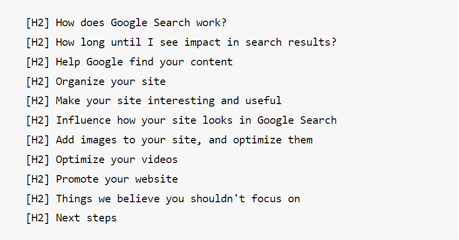
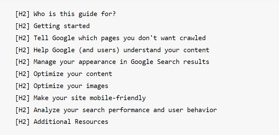
These are the main topics of the new webpage:
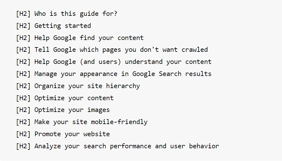
Here are the main topics of the previous webpage version:
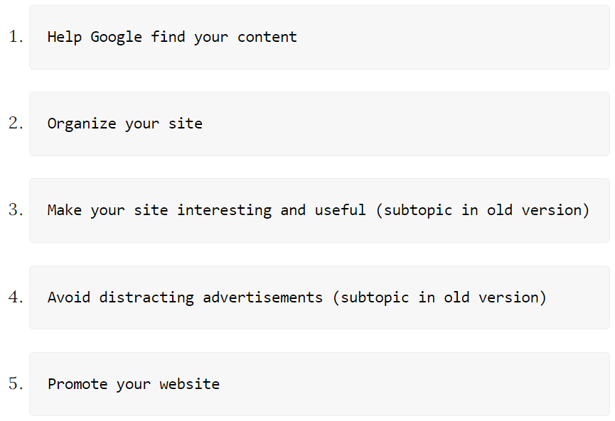
Only five topics were carried over to the new starter guide:
These are the discarded as main topics:
The advent of mobile devices has significantly altered the way people consume content. Content consumption has evolved to a “need-to-know” basis. In the pre-mobile era, accessing information on the internet often required physically moving to the nearest desktop computer or laptop. Nowadays, whatever information is required, no matter how trivial, is just a few clicks away, and it’s not always in the form of a lengthy, comprehensive article.
Setting aside the convenience of having access to content anytime and anywhere, scrolling through an excessively long article can be rather inconvenient.
What the new webpage achieves is a balance, offering a precisely focused, on-topic webpage that maintains comprehensiveness without becoming excessively lengthy.
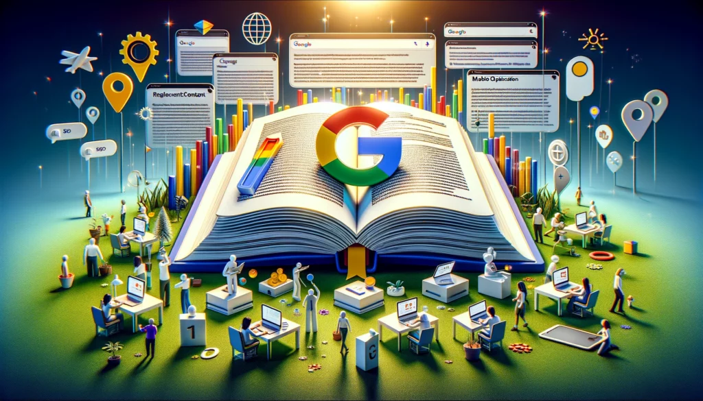
Finally, the images on the new webpage exhibit a consistent color scheme and design. In contrast, the old version featured a wide range of colors, with one being yellow, another bright red, and some even incorporating photographs. Many of the images seemed disjointed, like players from different teams wearing mismatched uniforms.
Even when using stock images, selecting images from the same artist can contribute to a sense of cohesion within the webpage.
The new webpage, thanks to its images sharing similar colors, imparts a heightened focus to the entire page and conveys a sense of professionalism, ultimately fostering trust.
While there may be more insights, these are the key takeaways that I’ve identified:
Original news from SearchEngineLand