It’s fair to say that a manufacturing company logo sits at the heart of the company’s visual brand identity. Its colours dictate the colour palette used in the web design as well as in brochures, adverts, billboards and vehicle signage. But the logo must do far more than set the colour scheme – it needs to say something very specific to the viewer.
Customers have certain expectations when purchasing products from manufacturing companies: they expect the products to live up to their claims, to be reliable and outlast their guarantee; they expect the company to be trustworthy; and they expect the company to deliver the right product at the right time.
A manufacturing company logo must persuade a potential client that the products and service will meet these expectations. The biggest manufacturing companies in the world have no nonsense logos that are bold and solid. Try to think of a mega successful manufacturing company with a pastel coloured logo based on a delicate floral design, and you’ll be thinking for quite some time.
So let’s look at some of the world’s most famous manufacturing company logos and see what they say about the company.
Caterpillar Logo
Known for designing and manufacturing heavy duty machinery such as knuckleboom loaders and road reclaimers, the brand identity is built around simple black and bright yellow. In the past, the logo showed the company name, Caterpillar, in strong, bold capital letters suggesting reliability and strength. A small yellow triangle was used to not only brighten the logo and attract more attention, but yellow suggests energy and enthusiasm – and so can impart the message that this company has the drive to get things done.
![]()
As time has gone on the brand is so well known the company name is now simply known as CAT – and the logo has evolved to update this – a strong black, simple design with the eye catching yellow triangle.
![]()
What does this logo say: a reliable company which can manufacture machinery without fuss
3M Logo
It may be easier to identify the products that 3M does not produce! Formerly called the Minnesota Mining and Manufacturing Company, this American company produces more than 55,000 products including electronics, medical devices, dental products, adhesives, car-care products and many, many more.
![]()
The bright red of the 3M logo signifies determination and passion, and this company has obviously been very driven from its very beginning to get where it is today. The wordmark logo could not be simpler – both in design and in the fact that the company name is the only thing to be seen.
What does this logo say: a bold company which is not afraid to stand out from the crowd and to lead the way
Intel Logo
Synonymous with the ‘Intel Inside’ tagline shown on many computers, Intel is an American multinational corporation know for producing the essential microprocessors that most personal computers rely on. Not content with this accolade, Intel also researches electrical transmission and generation, and is continually updating its microprocessors.
![]()
The Intel logo is a simple wordmark, showcasing the company name. The reassuring gentle blue is associated with calmness, trust and power. But unlike the geometric lines shown in the Caterpillar logo, the Intel logo shows the company name encapsulated within a broken oval.
What does this logo say: a company which is professional and trustworthy, but one which has an innovative flair
Mitsubishi Motors Logo
A giant of the automobile industry, this Japanese company is part of the Mistubishi Group and by 2007 had produced a staggering 1.3 million cars.
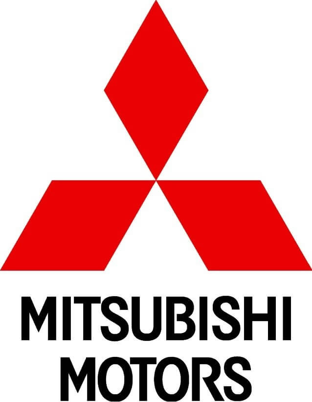
The logo clearly shows 3 red diamonds positioned around a centre point, and resting atop of the company name shown clearly in black. Interestingly there is a historical aspect to this logo – it was chosen by the founder of Mitsubishi (Iwasaki Yatarō) because his family crest comprised 3 rhombuses on top of one another. Additionally Mitsubishi is a combination of ‘mitsu’ meaning 3, and ‘hishi’ meaning water chestnut or diamond shaped.
Suffice to say most people who see this logo are unaware of its origins. However what they do see is a bold, bright logo with a clean cut geometrical design where the company name is clear to see.
What does this logo say: a solid company with strong foundations which can produce quality and reliable cars
The Similarities in Manufacturing Company Logo Designs
It’s quite apparent that the logos of these mega manufacturing companies share the same design elements:
- Bold and simple
- Few colours, often bright
- Plain fonts
They are either wordmarks, where the company name forms the basis of the logo, (Caterpillar, 3M, and Intel) or an emblem where the company name is inextricably connected to a pictorial element (Mistubishi Motors).
New Design Group Manufacturing Company Logo Redesigns
New Design Group has rebranded a number of manufacturing companies to ensure their visual brand identity and logo are saying all the right things to potential clients. Within the restraints of a rebranding project – where the new brand identity must still be comparable to the original – let’s see how New Design Group’s manufacturing company logo redesigns compare to the world’s biggest and best.
PSP Fabricating Inc. Logo
PSP Fabricating Inc. is a leading manufacturer of safety covers, hot tub covers and solar blankets. New Design Group updated the original logo to create a vibrant 3 dimensional version. The company name is shown in simple black font and is complemented by a green and blue emblem reminiscent of a rolled-up cover. Blue and green reinforce the company’s link with water and with energy saving, and the colours subconsciously tell the viewer that the company is reliable and trustworthy.
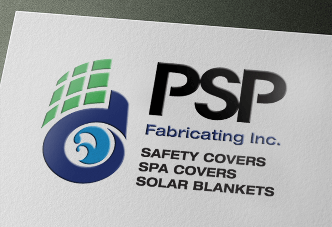
What does this logo say: a company which cares about the environment and will provide the right solution for a client’s needs
Spacefile Logo
Spacefile is a Canadian manufacturer of innovative storage products developed with modern engineering. New Design Group were brought in for a rebranding project. The company’s original logo design was a very simplistic emblem comprising the company name and a geometric shape all in black.
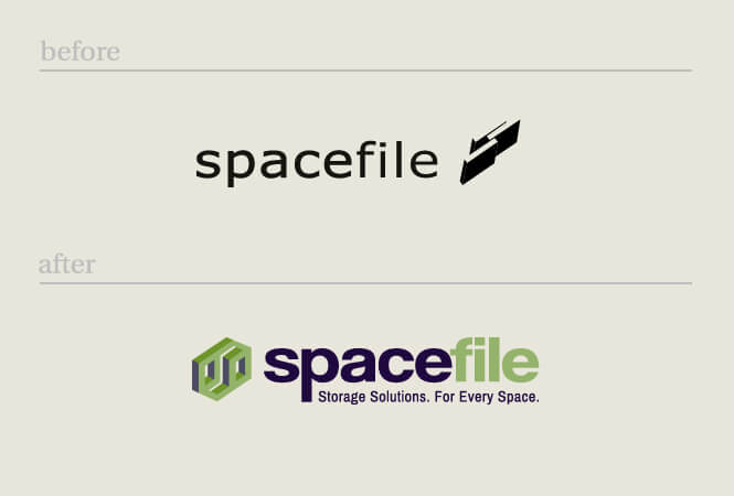
New Design Group updated the logo to one with far more impact. The company name is shown boldly, and by using two different colours – ‘space’ in a dark and more prominent blue, and ‘file’ in light green – it is immediately apparent to the viewer that this company is involved with storage issues. The geometric shape has been retained but updated with a 3D look and appears in the same light green.
What does this logo say: a company which knows all there is to know about saving space and one which delivers a professional service
-
PowerOn Logo
PowerOn is a successful industrial automation company which provides electrical engineering, programming and custom control panels amongst other automation specialties. When the company hired New Design Group, the existing logo was designed around the company name, shown in plain black. The most eye catching feature was the large, almost florescent green disc, with concentric circles suggesting rotating equipment.
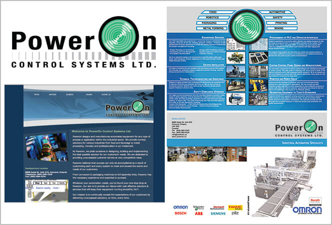
After the redesign project, the logo was transformed into a sophisticated version of its former self. The company name was still maintained in prominent black but a less vivid green 3D disc replaced the original – appearing like a large machinery ‘start’ large button, and with white swirls to suggest moving parts. The tagline ‘Control Systems’ makes it clear that this is a precision engineering business.
What does this logo say: this trustworthy company delivers the right precision engineering solutions for its clients
In Summary
A manufacturing company logo must show that the business can meet customers’ expectations by providing reliable and quality products as and when required. The big boys of the manufacturing world have bold and bright logos that show them as solid and dependable: their minimalistic designs are equated to fuss free service in the customer’s mind. The manufacturing company logo designs created by New Design Group similarly get these key messages across to their audience.
If you own a manufacturing company but suspect it isn’t saying the right things about you, contact New Design Group for a free quote and to start discussions to get you on the road to success