
Spacefile International Corp.
Spacefile
Manufacturing
Brand Identity Design
Promotional Materials Design
Employee Uniform
Truck Graphics
Website Design
Spacefile is a Canadian manufacturer of high-density storage products developed with modern engineering know-how and which builds its products on site. The company prides itself on excellent client service and in its 43 years, has provided customised solutions for all manner of business and locations which needed an innovative approach to storage.
The Challenge
Whilst Spacefile had many satisfied clients to their name, they needed a more persuasive and influential presence in the market place. Their aim was to bid on larger projects for governmental organisations, museums and large archive businesses and to compete on an equal footing with its largest competitors.
The Solution
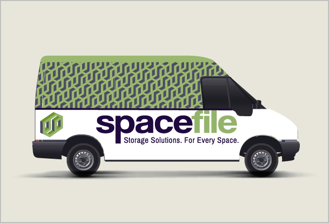
Spacefile worked with New Design Group on a total rebranding project, encompassing the logo, business card, brochures, vehicle livery, signage and an updated website.
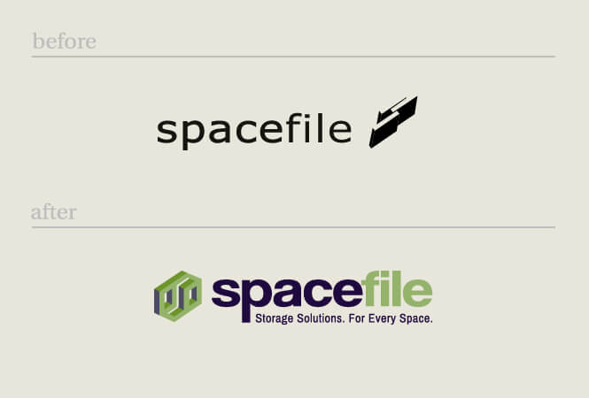
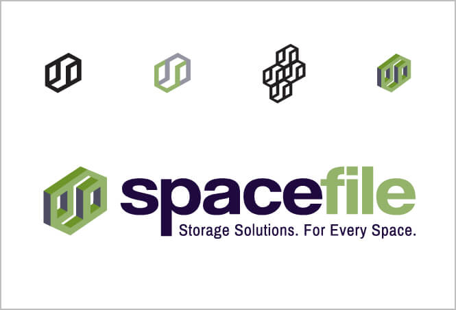
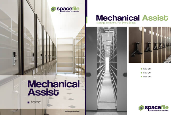
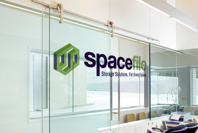
The original Spacefile logo was a simplistic black wordmark logo featuring the company name. The redesign maintained the wordmark approach but the colour scheme was updated to a dark, corporate blue plus a modern light green – showing that this company was moving with the times.. In addition to having a small eye-pleasing geometric shape reminiscent of storage units, the tagline leaves the reader in no mystery about what the company offers – Storage solutions for every space.
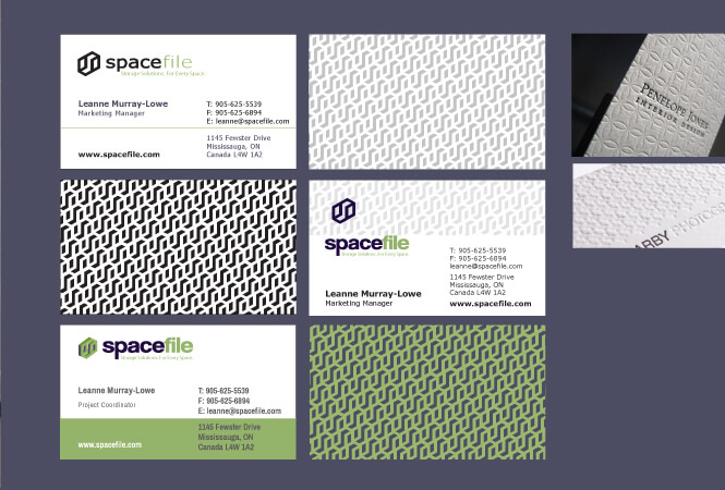
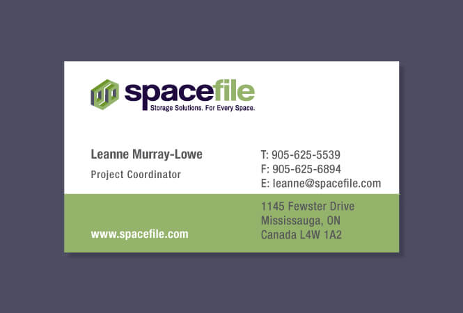
Business cards were designed with the updated logo and a light green section, making these stand out every time compared to business cards with a plain white background.
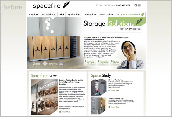
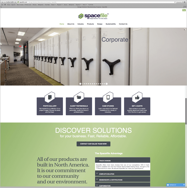
The website redesign converted a slightly text-heavy homepage to a modern and slick design which gives prominence to photos of the very many storage solutions offered by the company. Navigation is a breeze with simple click through images and concise text boxes. And the corporate blue and light green are carefully balanced throughout.
To complete the brand redesign, signage and vehicle livery were designed, focusing heavily on the eye catching logo and the use of the new company colours – dark blue and light green.
The Spacefile rebranding case study is a perfect example of how an original brand can be carefully enhanced to show the company in its true light – for Spacefile the modified brand made the company appear more professional, more modern and cutting-edge, and more reliable. Result? Spacefile doubled in size after this successful rebranding project.