Mylk Uncookies
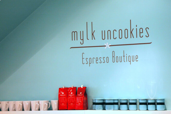
Mylk Uncookies Espresso Boutique
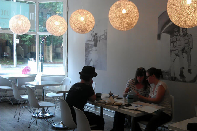
Cafe. Retail
Verbal branding
Identity & design
Packaging Development
Employee Uniform Graphics
The Mylk Uncookies Branding Case Study – The Nostalgic Case
When the owners of Mylk Uncookies decided to open their espresso boutique in Cabbagetown, Toronto, they turned to New Design Group for help with their branding. The two owners had long dreamt of opening their own business and wanted to do something community orientated. Being health conscious, they decided that a coffee shop concept with a twist was the way to go.
When the company owners met with New Design Group’s creative team to discuss the objectives for the business, it became quickly apparent that Mylk Uncookies definitely had a unique selling point: this coffee shop was aiming to specialize in raw and vegan treats in addition to offering non-vegan goodies. The company name was created to reflect this: mylk is commonly used in the vegan community for a milk alternative, and when treats are raw, they are definitely uncook(i)ed.
Not only was the company name indicative of the products on offer, but the play on words was a deliberate ploy to instill a sense of nostalgia in people who would fondly remember eating their milk and cookies as children.
Mylk Uncookies needed a professional brand to make the coffee shop and the products stand out in a market saturated with other cafés, and to reflect the unusual raw vegan treats on offer. In addition, the location, in a less developed area of Toronto, was well known for discount shops and housing projects and so the brand needed to persuade people to travel regardless of the diverse location.
Branded business cards, menus, signage and take-away packaging were all required and needed to meet the challenges head on. New Design Group realized that the clever company name would automatically call out to vegans who would be interested to learn more about the mylk on offer; non-vegans would be intrigued by the play on words. Therefore the design had to make the coffee shop name stand out proudly from all branded materials, and had to be eye-catching, welcoming and above all, professional in appearance.
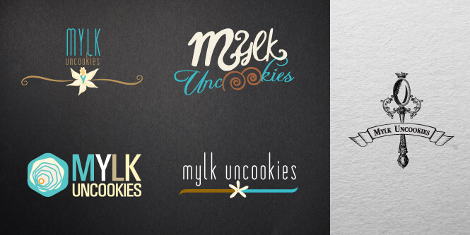
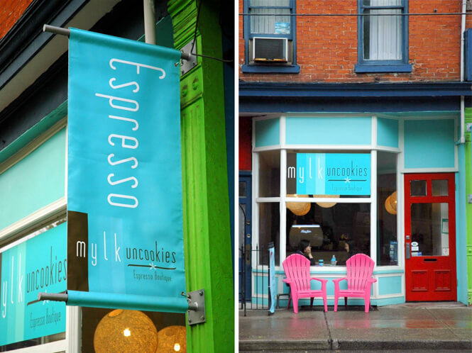
Several different concepts were presented to the client based on their creative brief. These ranged from a logo showing an ornate spoon in black on white, to a selection of four more modern designs created in turquoise, brown and white – brown for the uncookies, white for the mylk and a bold turquoise to add zest and life to the logo.
The owners finally selected the most simplistic of the logo options where the company name was drawn in a simple lowercase font. Once this format was decided upon the design team made further modifications to create the final designs for a number of branded elements.
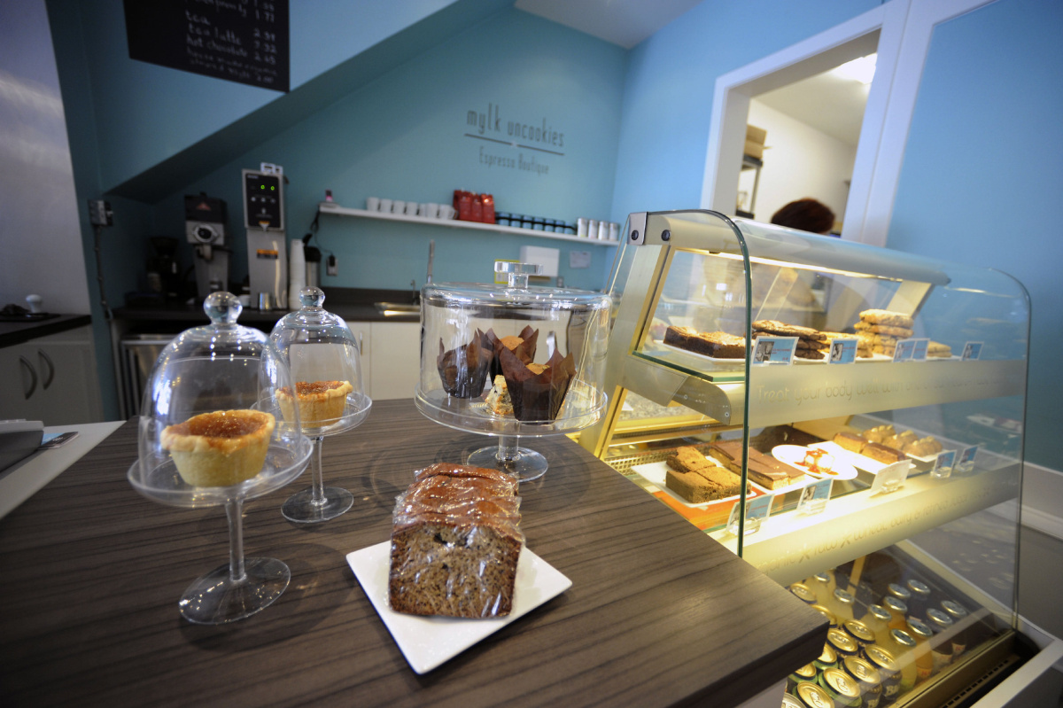
The final designs for the business card, signage, menu and take-away packaging were all very similar to maintain brand harmony perfectly. The background of the design was created from blocks of colour: the first being dark chocolate brown and the remainder varieties of turquoise. The simple font for the company name was maintained along with ‘Espresso Boutique’ to further stress that the establishment offered coffee and treats in small but comfortable surroundings. The final result was a colourful, highly professional and striking design where the Mylk Uncookies name was proudly displayed.
The company owners were delighted with the branding of their company and loved how the bright turquoise of the store front sign highlighted the coffee shop name clearly. It encouraged passers-by to come in for a comforting treat, whether they were vegan or not. The branded take-away bags looked classy and were another great way to advertise the venue to others when carried away from the café. Overall it was a very successful branding project which combined modern design with nostalgia for simple childhood pleasures.