
Last updated on
When a visitor lands on your website home page, it has its work cut out. Within a few short seconds it must convey a clear message and persuade the visitor it offers precisely the information they are seeking.
But are the sliders – the continually changing images at the top of the page – helping get your message across?
Sliders, also known as a carousel, have been popular for a while. But research has shown its time to ditch them completely! However nice they may look, they can seriously damage your conversion rates for all of the following reasons:
Sliders typically have a fundamental flaw – their size, position and the fact that they keep changing is far too reminiscent of a banner ad for many people. And so they just ignore them – without even thinking about it. As banner advertising has increased across the internet so has banner blindness – visitors simply ignore these often irritating interruptions as they focus on the main body of the website as they try to find the content they are looking for.
Even if your visitors do take note of your sliders, the variety of messages that they are bombarded with may pose a conundrum – give a visitor a choice of calls to action and they are likely to take no action at all. Best case scenario is that they just see the first slider and click on that image, completely overlooking all other messages you are trying to impart.
Keep the time delay between sliders too long and you visitors won’t even realise there are more images beyond the first one they see. Speed things up and your reader may struggle to read and properly absorb the information before the slider widget merrily skips on to the next – let alone decide if they want to press that all important call to action button.
The fact that more people now access the internet via a mobile device than a desktop computer renders sliders even more problematic – they just don’t work well on smaller gadgets. The image size has to be reduced making any text or call to actions invisible to all but those who have a magnifying glass to hand. And this is bound to irritate the viewer.
Sites with a number of high resolution slider images may take a long time to load, a situation compounded when the user is on a mobile device using WiFi access. As these users wait for the website to load, they will soon tire of the delay and will try to backtrack as fast as possible.
A slow lead time will inevitably increase bounce rates. And as bounce rates increase, Google will see your website as a poorer fit for organic search results – so you will be downgraded in the rankings list.
There are also other aspects of sliders that will impact negatively on your SEO – text within the slider image is invisible to Google and you’ll have pesky duplicate H1 tags due to the slider widget, that you really don’t want to have.
A Hero to the Rescue – Instead of using sliders in your website design, use the hero layout – a single “hero” shot with a concise message and a clear call to action. By conveying a simple, single message to your website visitors on your homepage, you will find your conversions improve considerably.
So what is the hero layout? Think Dropbox…..think Twitter.
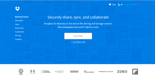
They both use the hero shot to perfection – a clean, simple, static design sitting above the homepage fold. This kind of approach will help drive business your way because it results in:
a) shorter loading time
b) consistency across different browsers and devices
c) no duplication of H1 tags which Google sees as keyword spanning
But the most important advantage of the hero layout is that when optimised it calmly leads your visitor by the hand and directs them to take the action you want them to. Modern websites which have embraced the hero layout know the importance of simplicity – less is indeed more – and so their homepages feature a stationery and often impressive image alongside minimal text and an opt in button – all beautifully laid out above the fold.
And what does the website visitor see? A clear message, a professional layout and no doubts about what action they need to take should they wish to take their journey further.
As far as we are concerned there really is no competition between sliders and heroes – and we can only recommend that you get off the carousel and go find a hero of your own without delay.
Update 24 Nov 2023